It’s curious because I’ve working with data visualizations and programming and all of these fancy software, yet it’s been some time since I’ve really played with Excel. I did take a Computer Business Applications course way back some time during secondary school. I can’t recall if I ended up getting certified for that course. We hit Excel, Word, Access, and PowerPoint. Access was interesting; it used some version of SQL.
But Excel and the good ol’ PivotTables. See, I know how to whip up some cool visualizations in Python with Matplotlib and Seaborn… and I’m learning to use ggplot2 in R… but PivotTables seem to really be the workhorse of the corporate world.
The UI is fairly intuitive. The visualizations and graphs are easy to generate. I wonder if I should pick up PowerBI some time in the future.
From the training given to us, the first thing I’ll note is the quality of the dataset. It was hard to find good combinations of variables and I wish we had a data dictionary. Ah. Oh well. We had Grinnell Census data from 1870.
I do note how manual the process is, in contrast with the elegance of a .csv file and a few flourishes of code. Once your data passes more than around 100 entries, let alone hundreds or thousands of cells, I think I’d much rather fish around in Python to deal with those visualizations.
You do get some nice control of your graphs, though.
Take a look:
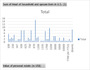
Nice and grainy, just how I like it.
Leave a Reply