Blog

  • Creating ArcGIS Story Maps – The Two Popes (2019)

    For this Vivero training, I was directed to utilize ArcGIS StoryMaps to create a website on some form of media (such as a book, film, TV show). It incorporates images, videos, and geospatial data. I scoured my memory for a movie option that would work for this project.

    In lieu of Pope Francis’ recent death, I opted to do the project on The Two Popes (2019), a Netflix film adaptation / dramatization of Pope Benedict and the future Pope Francis. I remember watching the film a year or two ago with my family. I’ve heard that it had several historical inaccuracies and took several creative liberties. However, for a lay audience, I remember having a positive impression about it. Perhaps it’s worth revisiting some time. My StoryMap gives a basic run through of the movie’s premise and includes the Netflix trailer, some images, and a few maps using ArcGIS’s functionality. It was a good way to experience making a StoryMap.

    The largest functionality of doing this with Esri’s ArcGIS and with StoryMaps is being able to use their built in geographic maps and geospatial data and visualizations. Without that feature, it feels like any other website builder– albeit more streamlined and “clean”. It is close to a standard “drag-and-drop” website builder, but with greater functionality and a better interface. Overall, I can think of many use cases of creating a StoryMap.  For most organizations, this is all you need!

    How would you feel about helping someone else learn how to use it? What are the benefits and limitations of this tool?

    This seems like a fairly straightforward tool to use. The hardest part of helping someone else would be navigating the log-in and the institutional account portion. I appreciate how elegant the interface is and how easy it is to set up a functioning website for a person. The drawback, of course, is that the College has to pay for an (likely expensive) institutional license for the technology. I wonder what their policy is for transferring StoryMaps after a student graduates from Grinnell.

    You can contrast that to having your own, personal, Domain of One’s Own, where you can run your personal domain and subdomains and your WordPress / Omeka / whatever websites.

  • (Computational) Textual Analysis with Gale Digital Scholars Lab

    It is a great coincidence that this week’s Vivero training is on textual analysis– this is what we’ve been pursuing for the past three days in my ENG 240 Digital Methods in English course, with Erik Simpson. Last class, we had learned about Voyant, another similar tool that offers a vast range of textual analysis and word counting tools.

    Textual analysis has many applications. I’m speaking in terms of computational textual analysis, rather than the traditional definition of “close reading” that you find in most English classes. Computational text analysis allows you to generate a new lens on your text that is often unachievable without the help of a computer. By tallying frequencies of words, phrases (n-grams as we call them), and other things like punctuation, digital humanists can make connections between texts and authors. In ENG 240, our class textbook, Nabokov’s Favorite Word is Mauve, applies these methods to reveal how statistical counting of words can tell us a ton about a text and the author’s intentions. You can even do things like find an ‘authorial fingerprint’ for a text. (See this article from the University of Chicago for a brief intro to this idea of Text as Data.)

    In class, we had used a mix of Voyant and Professor Erik Simpson’s own Python code that he created. It appears that the Gale Digital Scholars Lab is fairly similar. It offers an accessible way to do humanities computing, especially for students from a non-technical background.

    For the training document questions, I’d say that learning this tool was a touch more complicated than Voyant. Whereas Voyant seems to offer a (sometimes overwhelming) array of tools in its interactive dashboard, Gale Digital Scholars Lab functions in something like a library analysis tool. Gale offers a few guiding stages to your research project: Build, Clean, Analyze. The “Cleaning Stage” offers some useful presets and you can effectively clean the data without needing too much technical know-how.

    Regardless, the interface isn’t quite as straightforward as Voyant. It feels dryer and again, more like a library research tool. I’d still see several use cases for it, depending on my research topic.

    Ultimately, I am thankful to have been introduced to this field of computational humanities (also known as digital humanities, humanities computing, etc. etc.). It intersects my interest in statistics and programming with my interest in literature and the humanities quite nicely. It is worth additional exploration.


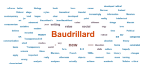
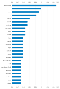
    EDIT: I forgot to add what I actually analyzed in Gale Digital Scholars Lab! I selected three philosophy papers for my corpus of text, and then ran an n-grams term frequency and created a word cloud.

    I chose three random papers on my favorite philosopher, Baudrillard, a French postmodernist. (Favorite as in I haven’t been exposed to many other philosophers, and so his ideas were my first taste of philosophy as a discipline). As can be expected, the almighty em-dash was the second most commonly used n-gram. Baudrillard was the most common, though I suspect the articles were commentaries about his work, so that makes sense.

  • Documentation (what a formal word!)

    Documentation seems to have a nice ring to it. It is in the same formal category as “deliverable” and “benchmarks”, though it feels less exclusively corporate than the other two. You can document a lot of things. Document your life. Document your classes. Document a website, or a procedure, or a lab report.

    Documenting your life– well, I think that’s what many blogs do. That was what sparked my original interest in blogging and websites, which was to somehow share the details of a life to others through the collaborative nature of the Internet. I ended up starting a Substack, and writing frequently (and now, more infrequently), all to document my views about the world at that point in time.

    For this Vivero training project, we learned about Project Documentation, and was provided a few examples to reference from previous projects such as the “Mapping Islamaphobia Project”. I ought to take a look (I haven’t yet…). Regardless, it seems like documentation is a large part of digital scholarship (and in science as well!).

    It’s not easy to write good documentation, though. I feel like it’s easy to complain about dry and lengthy documentation, but man, sitting down to write it was much harder. As part of the required Vivero Training, we were only meant to document a simple activity, something like logging into an app on your phone, but I felt like I wanted to do a little more.

    I started with writing a quick guide to logging into your cPanel Dashboard. Then, when it came time to submit the proof of my training to the Vivero heads, I thought, why don’t I upload it to the Internet using File Manager in cPanel? Well, now I gotta document that process as well. Hence, I have two documents, both published online: “Accessing Your cPanel Dashboard” and “Publishing a File Using cPanel“.

    This process has showed me the reverse side of documentation; normally, I’m the frustrated user trying to parse through the instructions. There’s definitely an art to writing documentation. I believe engaging and fun documentation is rare and under-appreciated.


  • WeVideo – Grinnell’s free video editing software

    Last week’s Vivero training module focused on WeVideo. WeVideo is a video editing software, for multimedia creation. The training involved walking us through the existing Vivero documentation on the software, and then creating a short 20-30 second video of me and another Vivero Fellow.

    Many of my weekly trainings are meant to be conducted with the other fellows, but we often end up just working on our own, somehow. This time, since everyone needed someone else’s face in their video for the final video, there was a lot more chatter and conversation in Burling Basement.

    The process was fairly straightforward, despite some difficulties with logging in. The College bought a ton of content and so I had a good stockpile of content and effects to work with. I used a flickering effect and some others, as well as dramatic historical drama stock music.

    What did you find most interesting? What did you find most frustrating?

    In my video with Ngoc (another Vivero Fellow), we discussed using WeVideo versus another common online video editing software, CapCut. I’ve used both at this point. To be fair, CapCut was easier and more user-friendly, though I appreciate all of the purchased stock content that Grinnell has bought for its students. I can access music, filters, backgrounds. It does take some getting used to.

    How would you feel about helping someone else learn how to use it?

    I’d feel great! It’s straightforward, and the hardest part is likely the account set up.

    What questions do you still have, and what parts of the tool do you want to explore more deeply?

    Well, having some officially working software for video editing is very useful. It might open up possibilities to short video projects, or to shoot a short film for the Titular Head film festival coming up on campus. I know the Mac desktops in the Digital Studio have iMovie, which is also another user-friendly (perhaps more user-friendly than WeVideo, though not as accessible online).

  • How did we get here? Reflection on Vivero Fellowship

    I always seem to be brimming with ideas after my meetings with Dr. Mo Pelzel, my Vivero project lead. I’ sometimes forget that he actually reads these blog posts (and it’s not just the ether and my Vivero heads). Hi Mo!

    After today’s meeting, I felt like there are a variety of paths that I can take, in terms of deliverables for the Vivero Fellowship. That word– deliverable– feels a little corporate. It makes sense though. We want a tangible product of this fellowship, and on my part, I want a project that represents my fellowship experience and encapsulates what I’ve learned.

    The interesting portion of this ‘tangible product’ is that we’ve allowed it to be rather flexible. There was a couple of ideas. There were two more recent project ideas that I should discuss, both stemming from disparate interests and connections.

    The first was the idea mentioned in the previous blog post about ArcGIS and creating a visual and geospatial guide for housing access resources in Grinnell. Through my work as a Housing Access researcher with the Service Leadership Work-Study program at the CLS, I’ve been interviewing stakeholders within the town of Grinnell about the state of housing access and affordability. What we’ve learned is that there’s an incredibly rich network of nonprofit organizations, all interlinked and collaborating with each other. However, there isn’t a unified platform to share all of this content– the closest resource is a document from the Drake Community Library that has large list of nonprofits. I was thinking we adapt that onto ArcGIS and create a geospatial map, with links to resources and more information, of the thriving nonprofit network at Grinnell.

    The second project came about from the course that started my Vivero journey: ENG240 Digital Methods in English, which I’m taking with Professor Erik Simpson. It is one of the ‘foundational’ courses you have to take to qualify to be a Vivero Fellow (side note: I had to ask for an exception from that waiver as I am taking ENG240 concurrently with my work with Vivero… but it’s working out incredibly). In ENG240, we have something called the Electronic Literature Project, where each student creates an interactive electronic story using an open-source software called Twine. These Twine projects are all open-source, completely free, completely licensable and open-access. Twine publishes directly to HTML, which is incredibly convenient. I believe this can be an incredibly valuable segue into understanding the essence of the Web and to explore the affordances of the Internet, and of the hyperlink. (Twine stories also rely heavily on the hyperlink). My proposed project would create a domain, perhaps called “Grinnell Electronic Literature Project”, where willing students from Erik Simpson’s ENG240 can publish their projects onto the public website. This would create a repository of student-created projects for reference by future classes. In the long run, this will establish a more vibrant community of electronic literature representation and expression at Grinnell.

    A more traditional idea involves working on documentation for the Sites @ Grinnell website, and creating material for students to better understand how to use Sites @ Grinnell. After all, it is this wonderful, and very free, domain hosting platform that’s available for all students– and most of us don’t know about it. This could be updating previous documentation, personalizing the rather dry Reclaim Hosting generic documentation, or writing new guides. An adjacent idea, one that excites me incredibly, is creating a four-part series of articles on the sites.grinnell.edu page. The four articles could go through: 1) Why create a domain of your own (and how it connects to the liberal arts), 2) How to request and install WordPress and applications, 3) What to do on on your Website (blogging, posting articles, cool features like publishing PDFs and files online), and 4) Advanced features such as File Manager, File Transfer Protocol, installing programming languages, checking out metrics.

    This article series could very well encompass parts of the original documentation idea, now that I think about it.

    In terms of my Vivero training, I’m excited to continue through this program. I am starting to see the objective of this program (perhaps I’ve alluded to it in an earlier post as well), which is to create a cohort and resource pool of digital literate student-mentors who can mentor other students. We’re really aiming to create that knowledge base on campus.

    Throughout my training, I’ve found most my interest has been concentrated in the domains and web hosting. It’s marvelous, then, that my Vivero bosses ended up matching me with the Web Literacy project, and with Mo and Sites @ Grinnell. I am really enjoying the process — the feeling — of posting ideas onto the Web. Another of my small pleasures is now being able to post files onto the Web: things like pdfs, mp3 and mp4 files, things like that! It’s intuitive, especially in cPanel. There are tons of possible things to do. I feel like I can be more of a Web citizen, and interact and publish and contribute to the Internet. In the end, that’s what this Vivero program is all about, and what I’m hoping to inspire in other students through working on Web Literacy with Sites @ Grinnell.
  • ArcGIS (Online) and mapping the world

    On my first bootup of ArcGIS, I found it to feel relatively similar to my experiences with geospatial mapping in Tableau. Of course, ArcGIS is much more focused on the mapping part, and Tableau is more focused on the data visualizations– meaning there is a little bit of overlap.

    Following the guide on the Vivero Fellows website (the one available to everyone and the public, not our internal documentation wiki), I walked through a simple geospatial visualization. There are many options to customize charts and graphs, and even the map you are overlaying your data on. I remember painfully trying to design a visualization in Tableau during a data science course and struggling to design the interface to accurately reflect my data (spatial mapping of humanitarian, financial, and military aid commitments to Ukraine in 2022). It seems like ArcGIS, provided with good data at least, is much more straightforward with that aspect.

    Looking further, I also found the official ArcGIS YouTube channel, which is fairly rich as well. It was surprising to see the frequent (and recent) posting schedule, and they seem to very active with their content.

    It looks pretty rough right now, which is why I’m haven’t posted anything from this training onto my website. You are able to upload maps onto a website, embed them into pages, and even create your own web app. That’s something we can look for in the future.

    For the future, I’d like to learn about performing analyses with ArcGIS Online. Vivero fellows get the  upgraded status of ‘publisher’, which offers fancier techniques to interpret your data, but I did not have time in this training to pursue that thread of thought. I can perhaps walk someone else through the process, at least superficially, and refer them to the right sources.

    I can think of a few applicable use cases of ArcGIS for my current work with Vicki Nolton of the Center for Careers, Life, and Service (CLS), where we are investigating housing access in the town of Grinnell. For example, I could create a web app that visually displays (overlaid on a map) the interconnected network of Grinnell nonprofits and aid organizations that support housing and food access. Hmm. Maybe this is worth looking into! Yet another project to add to the list.

  • I spread my influence on the Web even more (subdomains, Omeka, and the Internet)

    Today, I looked at Omeka. We created another subdomain, installed Omeka Classic, and then booted up some content. The content was just some images from Digital Grinnell (an intiative, that, by the way, I didn’t know existed. It’s super cool).

    Here is the link if you wish to take a look: https://www.exhibits.davidnguyen.sites.grinnell.edu/cms/

    The Vivello training today was setting that up and learning how Omeka works. Some highlights were downloading plugins and themes from online and learning how to use cPanel’s File Manager to import and extract those files directly in the backend of cPanel.

    I like this type of hands-on training. I suppose their objective is to train a batch of students with relative familiarity with these tools. Not a bad idea. I feel like I could at least show them through the process. My roommate is an Studio Art major. Omeka could be fairly useful for him.

    They want to know about the experience of learning Omeka. I’d say that it feels like a step back into the past. It’s a little more old-fashioned, and now that I know what it is, I’m recognizing how many old libraries and museums used it. It is very oriented towards display, whether that be art, images, or text. I feel like it would be a good place to display academic writing, if I needed to. For example, I might post my research papers, essays, articles, through that platform. Or perhaps it’d be great for long-form blog content. I think quite a few conferences use Omeka for their conference proceedings websites. I’d like to look further into what affordances Omeka offers over something like WordPress, which I think is more popular.

    There is a certain friendliness from these old-fashioned website platforms. I feel like most people don’t bother to look into this side of the Internet. Matter of fact, the distinction between Web and Internet and Net and etc, etc– well, that distinction is often not made. I used those terms interchangeably. There’s a huge difference though, in intent and meaning and purpose.

    This might be the topic of our next blog post!

  • I am now fully ready for the workforce (I finally learned PivotTables)

    It’s curious because I’ve working with data visualizations and programming and all of these fancy software, yet it’s been some time since I’ve really played with Excel. I did take a Computer Business Applications course way back some time during secondary school. I can’t recall if I ended up getting certified for that course. We hit Excel, Word, Access, and PowerPoint. Access was interesting; it used some version of SQL.

    But Excel and the good ol’ PivotTables. See, I know how to whip up some cool visualizations in Python with Matplotlib and Seaborn… and I’m learning to use ggplot2 in R… but PivotTables seem to really be the workhorse of the corporate world.

    The UI is fairly intuitive. The visualizations and graphs are easy to generate. I wonder if I should pick up PowerBI some time in the future.

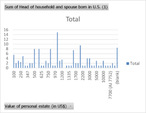
    From the training given to us, the first thing I’ll note is the quality of the dataset. It was hard to find good combinations of variables and I wish we had a data dictionary. Ah. Oh well. We had Grinnell Census data from 1870.

    I do note how manual the process is, in contrast with the elegance of a .csv file and a few flourishes of code. Once your data passes more than around 100 entries, let alone hundreds or thousands of cells, I think I’d much rather fish around in Python to deal with those visualizations.

    You do get some nice control of your graphs, though.

    Take a look:

    Nice and grainy, just how I like it.


  • I Got Audited! How It Improved My Website’s Accessibility

    Well, I did my accessibility audit. My domain is doing good, with that 95%… success rate? I passed all 20 main audits and there are three mysterious manual audits that I need to pay $29.99 for to unlock. So I’ll pass.

    No, wait! That was the sketch, Google-sourced, website accessibility checker. I went to the official, Vivero-sanctioned, accessibility checker and my website is falling apart. Structural problems with my “fully-justified text”, 5 alerts, a handful of contrast errors. This was eye-opening. I am learning lots on how to address these concerns.

    As part of this reflection, I watched a few Accessibility Perspectives videos (from the Web Accessibility Institute) and then read through the “WCAG 2 A and AA Checklist“, WCAG standing for Web Content Accessibility Guidelines.

    Elementor, the WordPress plug-in to add a few more buttons to the website making process (in the name of visuals and drag and drop!) offers an alt text option for images. I went ahead and added some description for my professional headshot. I also read the guide on how to write alt-text for images. They’ve made a nice decision tree to present when and how to use alt-text.

    One feature that I hadn’t considered before was making websites mouse-less friendly. Cursor-less? What I mean is creating a website that can be navigated using only your keyboard.

    Finally, I also thought about content-inherent design features that may impact accessibility. This might be writing clearly and without crazy jargon, or maybe describing your hyperlinks with link text, as opposed to something like “click me…”.